Planners and designers use geographic data to understand and describe a study area. Spatial analysis can reveal useful information about an area and help you assess its suitability for or vulnerability to development activities. You can use analysis tools with geographic data to understand opportunities and risks in an area. GeoPlanner has analysis tools that can help you increase your locational awareness so you can plan and design more effectively in a given geographic context.
The Explore segment contains tools to help you visualize your planning area and understand how it behaves or performs.

Functional areas of the Explore segment include the following:
- Add Data—Discover datasets from ArcGIS Online or your portal.
- Analysis—Execute spatial analysis tools to help you understand how an area performs. Tools include Create Buffers, Create Travel–Time Areas, and Enrich Layer.
- Modeler—Identifies suitability for development or an activity in an area by overlaying layers and ranking outputs.
Add Data
GeoPlanner allows you to reach out to ArcGIS Online or your portal and discover datasets that describe our world. Many of these datasets can be directly used in your planning projects. You can discover feature, map, and image layers. You can also discover weighted overlay models (suitability models) generated by other contributors from your and other organizations. If you share your own datasets to ArcGIS Online or your portal, you can also discover and add these dataset to your project.
Analysis
Data analysis tools create new layers for the following purpose:
- Depict how an area functions or performs.
- Depict how that performance relates to the active scenario or another polygon feature layer in a GeoPlanner dashboard chart.
GeoPlanner has analysis and classification tools. Analysis tools create new datasets that help you visualize a phenomena in or ask a question about an area. This helps you understand how an area functions. Classification tools allow you to rank values in those datasets to help you understand suitability of an activity in that area. Ranking, through classification, helps you understand how an area performs. Classification in GeoPlanner entails mapping input values to a suitability scale of up to nine values.
GeoPlanner has two types of tools available for assessment: spatial analysis and suitability analysis. Spatial analysis tools execute against feature layers and create output layers. Suitability analysis uses weighted raster overlay to generate a new image layer item in your organization.
Spatial analysis tools
GeoPlanner includes many spatial analysis tools hosted on ArcGIS Online or your portal. On ArcGIS Online, use of spatial analysis tools consumes organizational credits for both executing the tool and storing the output features. Each spatial analysis tool has a credit estimator so you can understand how many credits the operation will consume prior to execution. Cost of execution and feature storage tends to be very low.
After you execute a tool, you'll need to reclassify the output.
Classify
Classification helps you make sense of your data by sorting and arranging values into easily understood qualitative groups. GeoPlanner's Classify tool allows you to rank features in a dataset based upon attribute values to help you understand and visualize suitability. Ranking is a method to understand performance. This tool can be used against nearly any feature layer. It creates a new layer item in your organization. The layer item can be used as an assessment layer in the GeoPlanner dashboards.
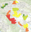
The following table displays questions that you might ask about an area to help you understand how that area functions. It includes a tool that helps you answer that question and an example output. It then shows how you could classify that output to help you visualize suitability or performance of that area.
| Example question | Tool | Output | Classify | Assessment Layer |
|---|---|---|---|---|
What is within a 5-, 10-, and 15 minute-drive? | Create Travel-Times Area |
| Green symbol—5-minute travel time, highest suitability. Yellow symbol—10-minute travel time, medium suitability. Red symbol—15-minute drive time, lowest suitability. |
|
How much of this area resides on wetlands? | Enrich Layer |
| Green symbol—smallest wetlands area, lowest risk or impact. Yellow symbol—medium risk or impact. Red symbol—most wetlands, highest risk or impact. |
|
Which neighborhoods had the most crime events? | Summarize Within |
| Green symbol—fewest crimes, lowest risk. Yellow symbol—medium risk. Red symbol—most crimes, highest risk. |
|
Custom Analysis
ArcGIS GeoPlanner allows you to discover and execute custom GeoProcessing services so you can access powerful analytical tools.
Modeler
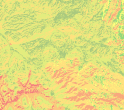
Weighted raster overlay is a technique for modeling suitability and helps you find the best location for an activity. GeoPlanner supports weighted overlay through a modeler widget in the Explore segment. The modeler widget allows you to browse and choose a service that supports weighted overlay through image layers (rasters) served from ArcGIS Server. GeoPlanner includesEsri-curated weighted overlay services. You can also create your own services if you have ArcGIS Server, ArcGIS Image Extension for Server, and ArcGIS Spatial Analyst for Server. The output of a weighted raster overlay analysis is an image layer item type in your organization. The output layer combines both assessment and classification steps described above.
The following table displays questions you might ask to help understand suitability for an activity in an area. It also shows layers that you could combine in a weighted overlay to visualize the answer to that question. Finally, it contains sample output layer graphics and an explanation of the classification of that layer.
| Example Question | Service & Layers | Output | Classification |
|---|---|---|---|
Where is fire risk highest in the forest? | USA Landscape Data
|
| Green—low fire risk Orange—elevated fire risk Red—highest fire risk |
Where are the best locations for growing grapes? | USA Landscape Data
|
| Green—best locations, highly suitable Orange—less suitable Red—worst locations, lowest suitability |
Where are areas of highest income and highest total losses? | Custom
|
| Green—lowest losses and incomes Yellow—medium losses and incomes Red—highest losses and incomes |
The Modeler utility helps you identify areas that meet your criteria by combining raster layers to produce suitability layers. These layers can also be used as assessment layers in the dashboards. You can create new or edit existing models from tools on this drop-down menu.


